newborn photos / cannon william ford

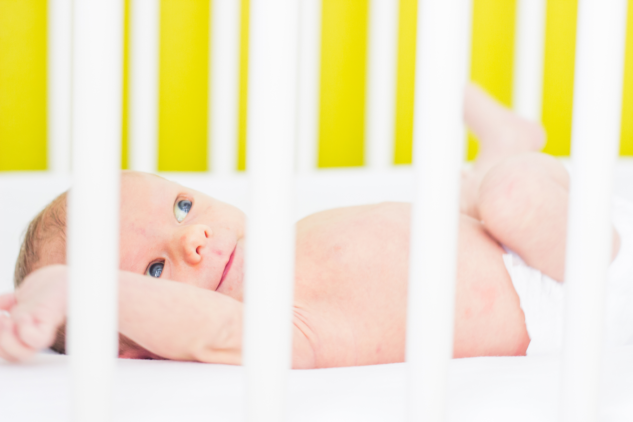
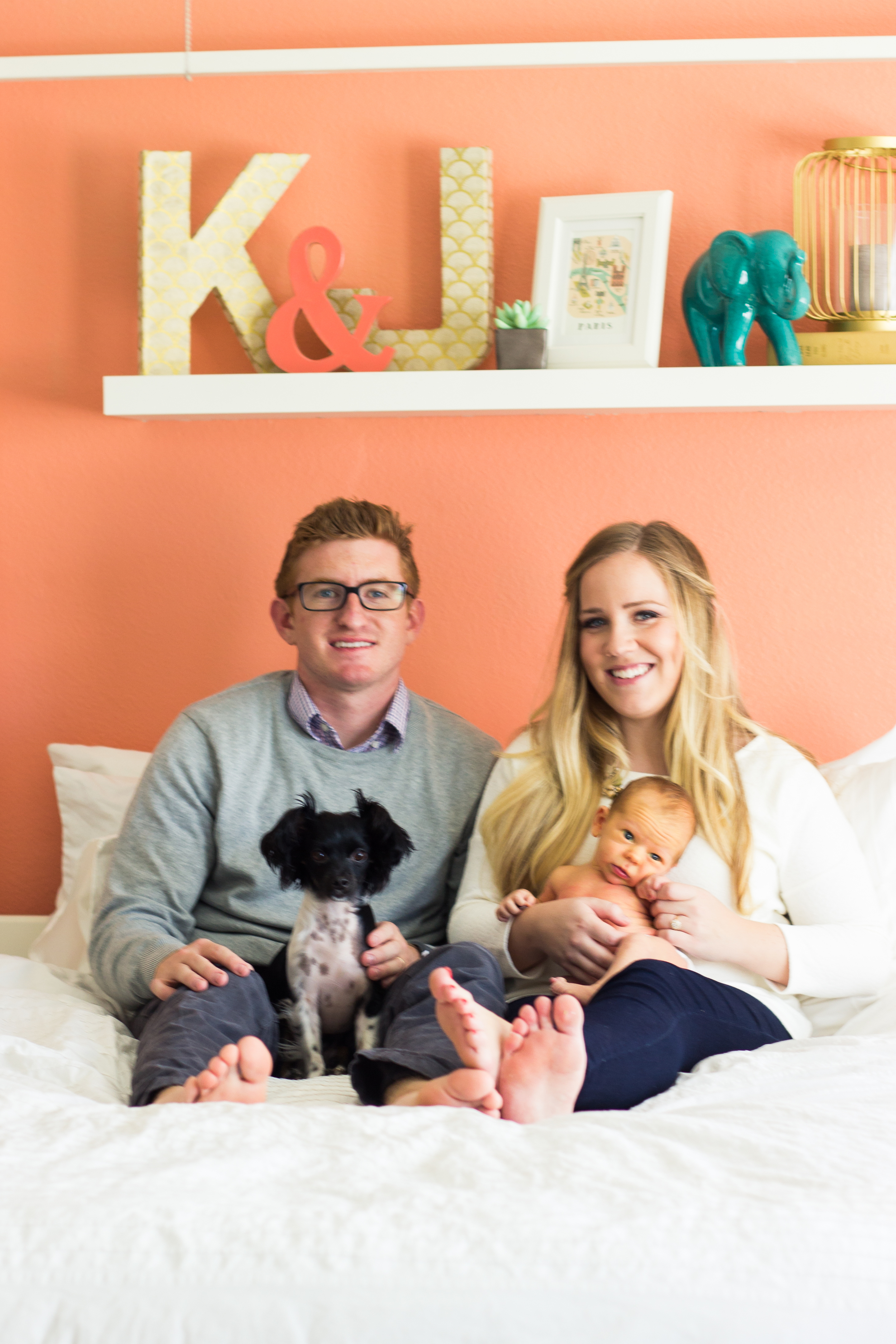
i was so lucky to be able to take this cute family's pictures. they are our good friends, and i'm so excited that they have a little boy just two months younger than jay- we have already decided they will be best friends. little cannon was adorable and wide awake this whole shoot. we took the pictures in their perfectly remodeled house- i'm in love with the nursery and the four poster bed in the master bedroom! family pictures might just be my favorite.

baby's room / it's finished!!!

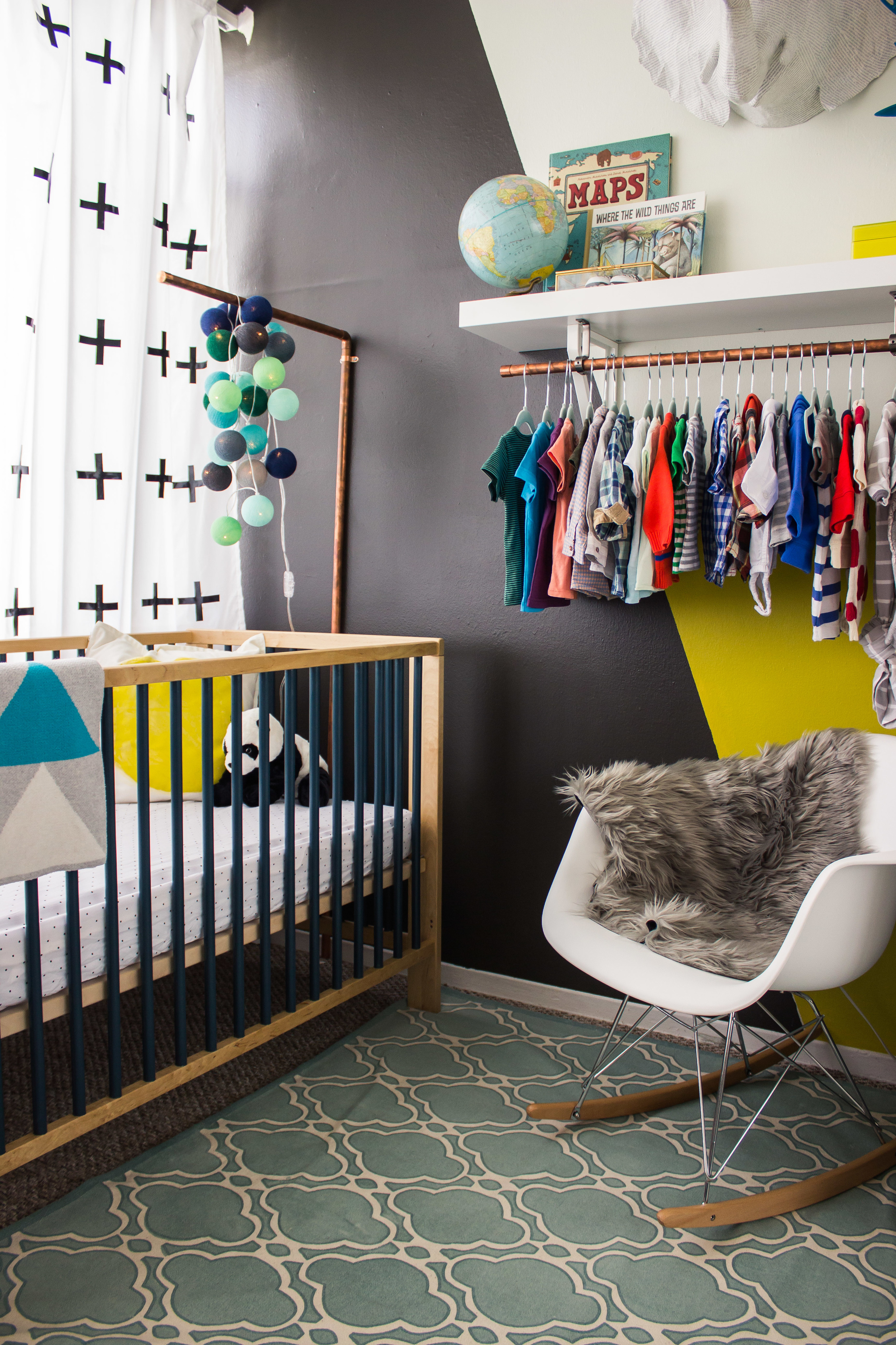
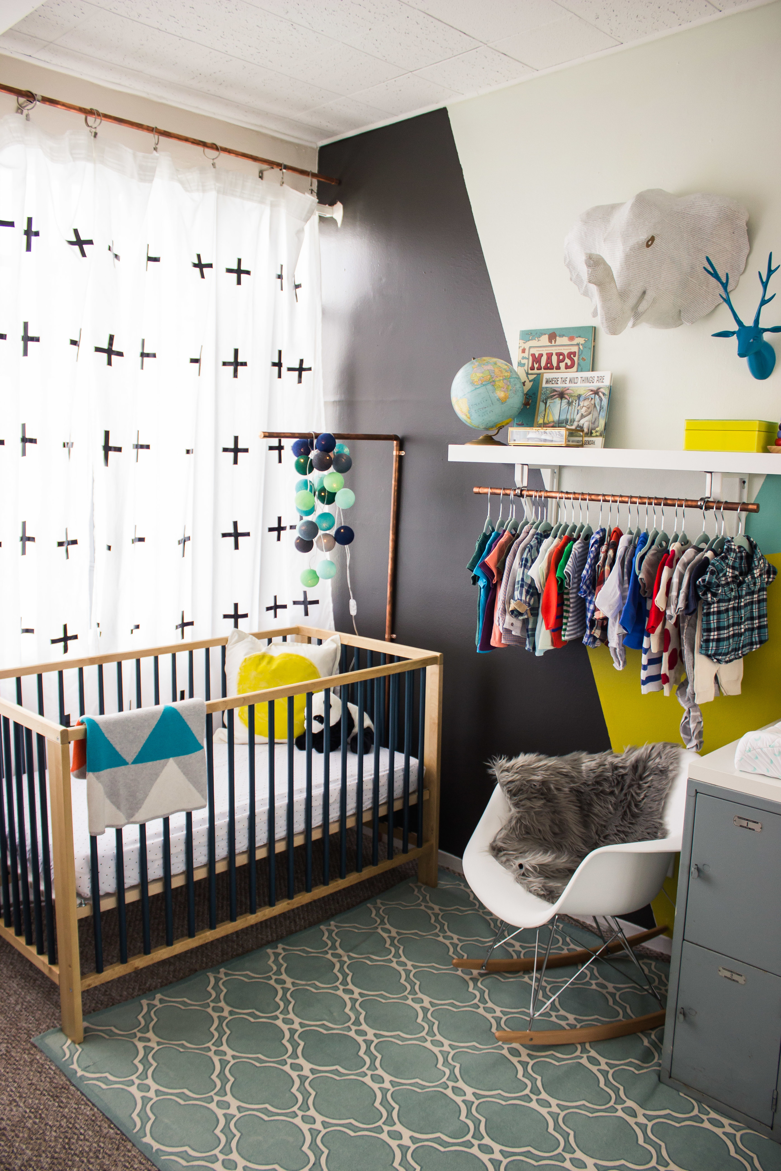
i have had lots of people ask for pictures of the baby's room and it's finally 100% finished! i am obsessed with this room- i seriously just want to sit in here all the time. we actually have had it like 90% finished for over a month, but a few technical difficulties set us back. for one- the shelf sagged so we had to fix that. and, in doing this room i realized how much i hate diy- i procrastinated finishing the curtains until last night! 

i came up with the plan for the room about two months ago. we were pretty much totally moved in to the house. it was getting close to october and i realized i had no idea what direction i was going in. so i spent a weekend on pinterest looking through my boards and coming up with a plan. you can see my original thoughts in this post.

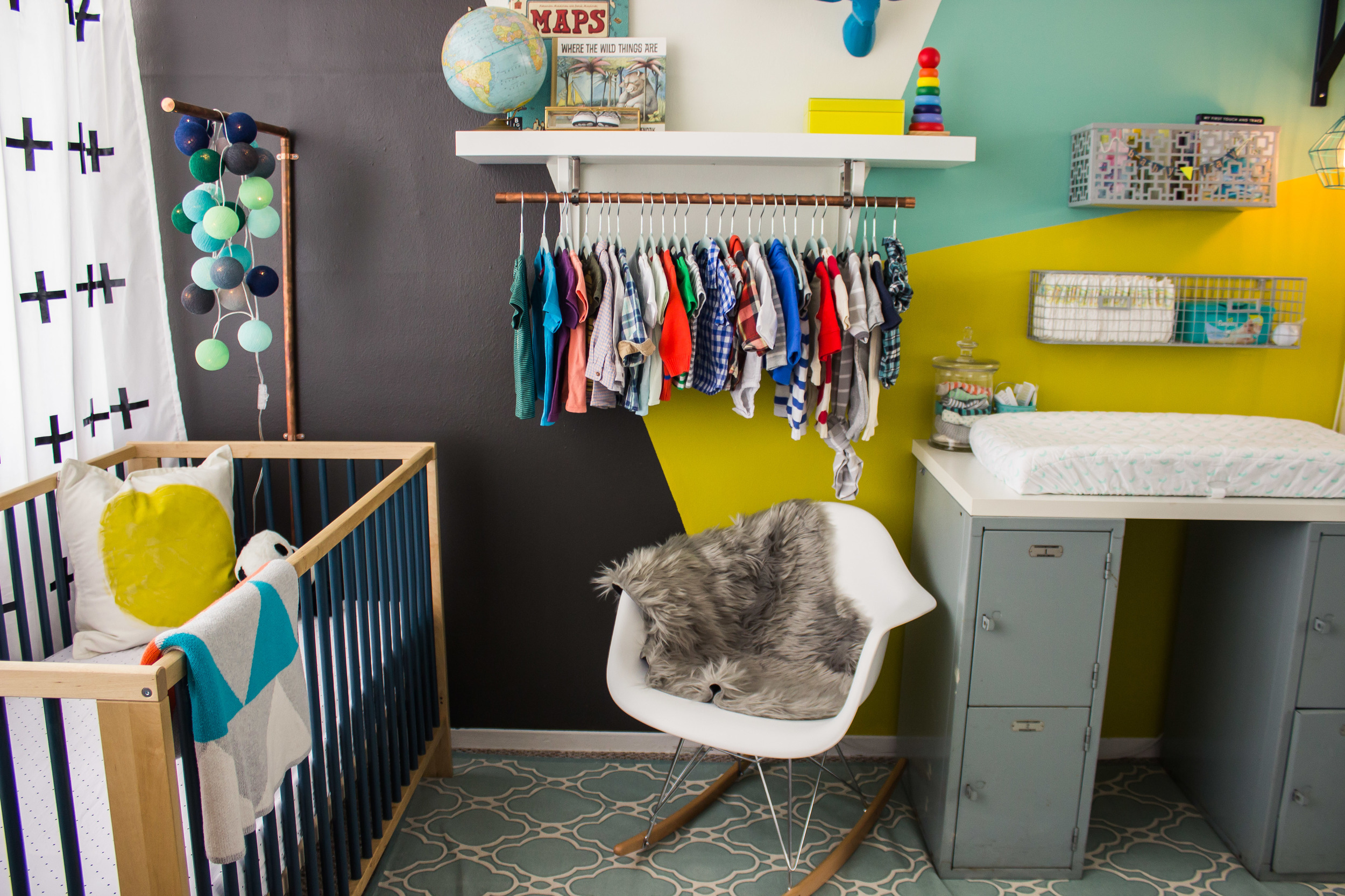
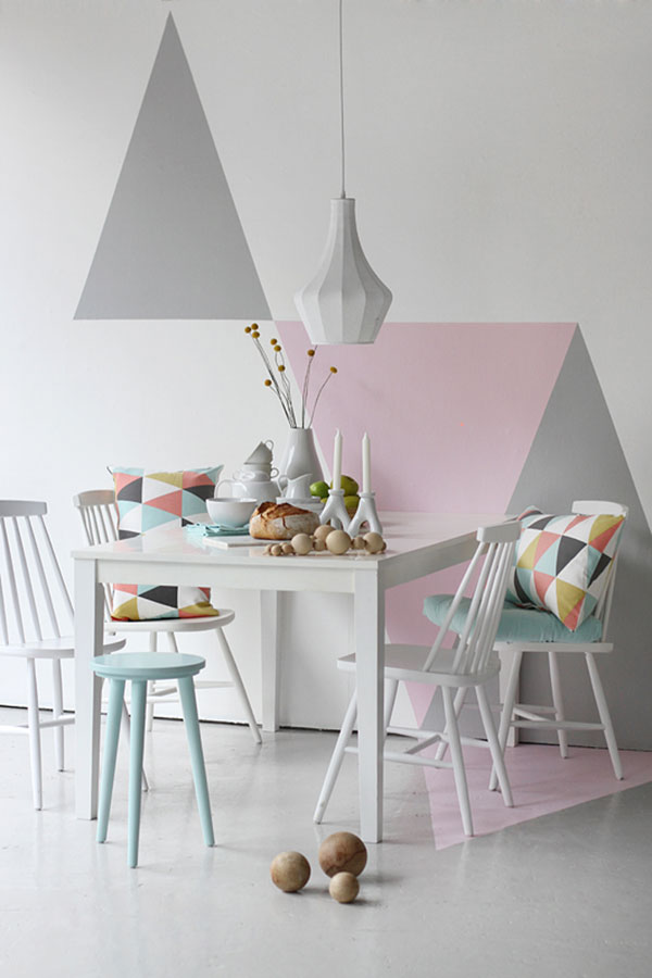
the very first thing we did was paint the wall (obvs). i wanted to do a geometric pattern, and came up with the colors. i made a drawing in photoshop to make sure i thought it would look ok. we got samples of each of the colors and jarman executed all of the painting while i was out of town one weekend. 

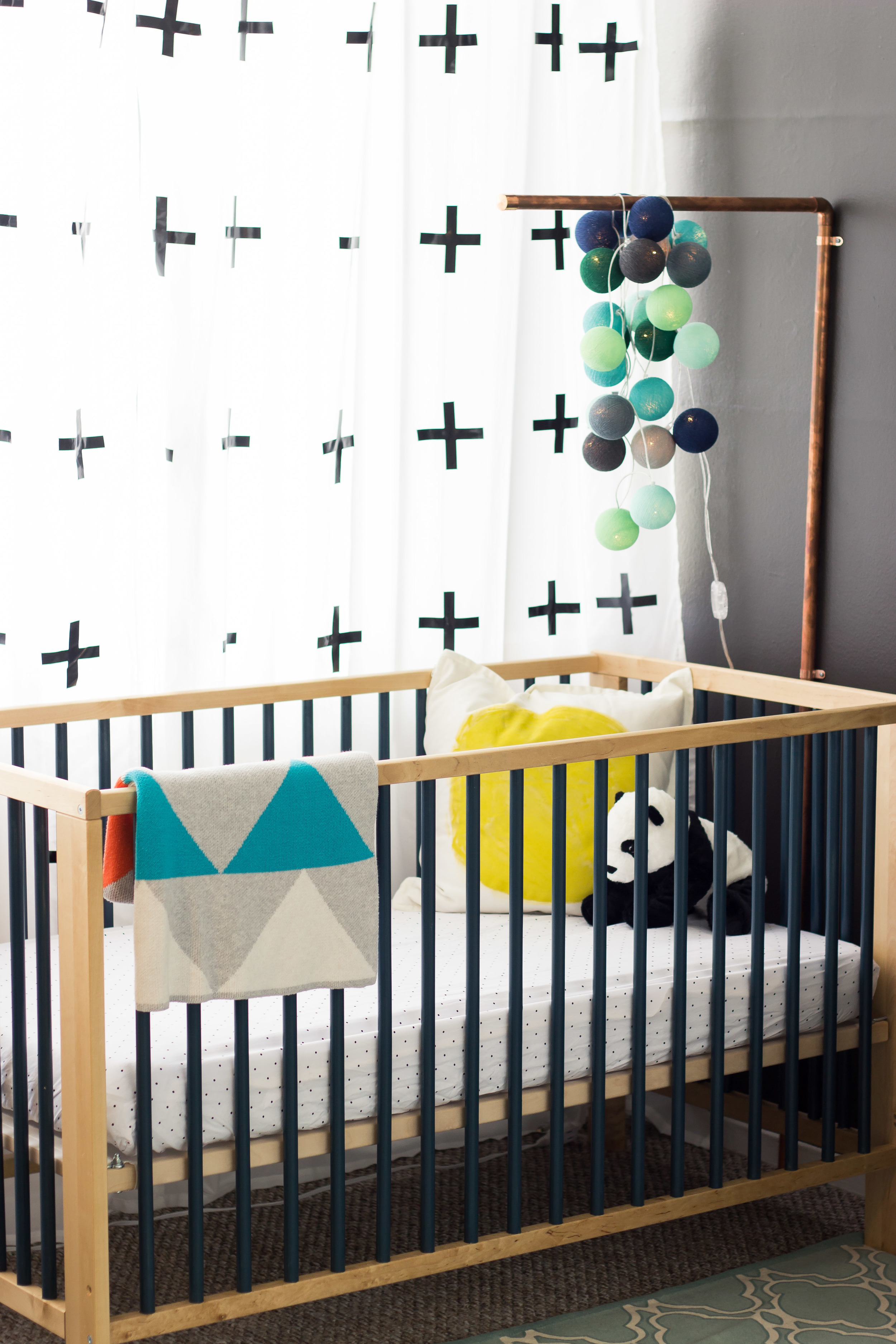
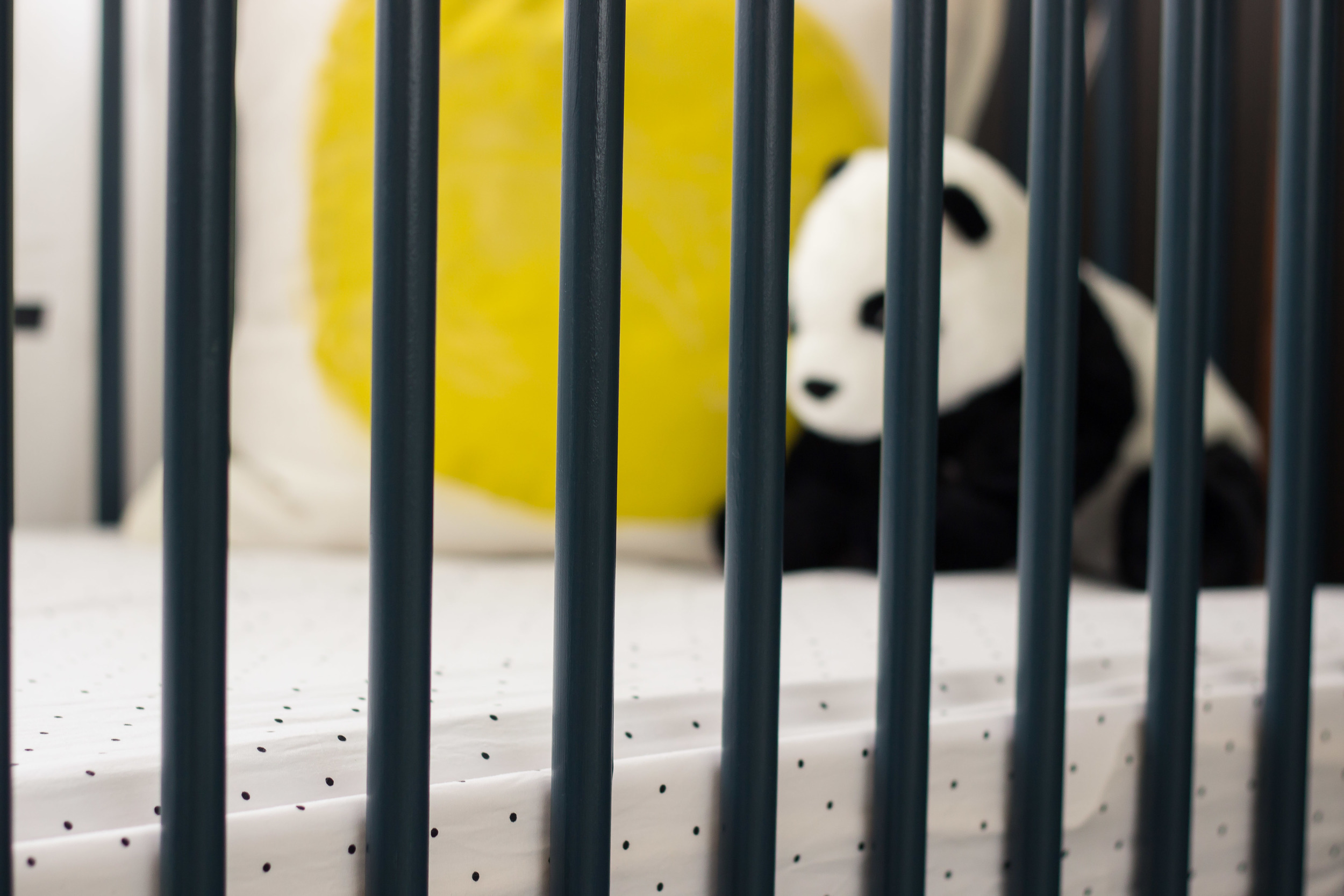
i loved the look of cribs with painted slats. only problem was those cribs were way out of my price range. so i got the ikea gulliver crib in natural wood color and painted the slats myself. this wasn't an easy diy- i almost died doing it i hated it so bad. the crib comes semi-put together: the slats were already connected to the tops and bottoms. this made it so i had to use a tiny paint brush around the edges to get good lines. i'm so happy with how it turned out- i think it looks awesome. but just know that it was not easy. i will remind baby jay of the hard work i did on his crib daily. oh and we used the same navyish blue that we painted the cradle- it was ____.

for now i'm using little black polka dotted sheets from target (they no longer sell these ones). i love their simplicity. i'm sure they will be changed out quite often. i actually painted the pillow. i got the fill and cover from ikea (a total of $9), and used leftover paint from the wall to make a big dot. it's so hard to find good pillow covers- i might start doing this for all my pillows! the little panda bear was also an ikea find. jarman plans to sleep with it for a few nights to 'get his scent on it', so that the baby will be used to it. or something ridiculous like that.

i always planned to make a gold himmeli mobile. but, then bright lab lights came out and i knew i had to use them somewhere in the baby's room (plus the himmeli that i tried to make looked ridiculous). i knew i wanted copper accents in the room- so i came up with this idea to make an arm over the crib out of copper, and hang a cluster of bright lab lights from it. the arm was super simple. i bought a 10' pipe of 3/4" copper (the cheapest kind- there were two different ones)- it was $17 at home depot. i had the rod cut in to a 5' piece (for the part that would climb up the wall), and 2' piece (the part that extended over the crib), and a 3' piece (which i used for the clothes rod. i got one 90 degree angle connecter, 3 end caps (2 of which were also for the clothes rod), and 2 wall connectors. we super glued the pieces together, then screwed the arm in to the wall. i love how it looks- especially against the dark color on the wall.

i really wanted plus sign curtains- but again didn't want to spend a lot. i got two sets of plain white curtains from ikea and added the plus signs myself. i first tried stenciling the plus signs- but that would have been a nightmare. i settled on using black electrical tape! ha so random i know, but they turned out just how i wanted them to! i continued the copper theme by using copper pipe as the curtain rods, and just used the basic hardware from home depot to hang them. the curtains make the room look so much better- behind them are more ugly vertical blinds.

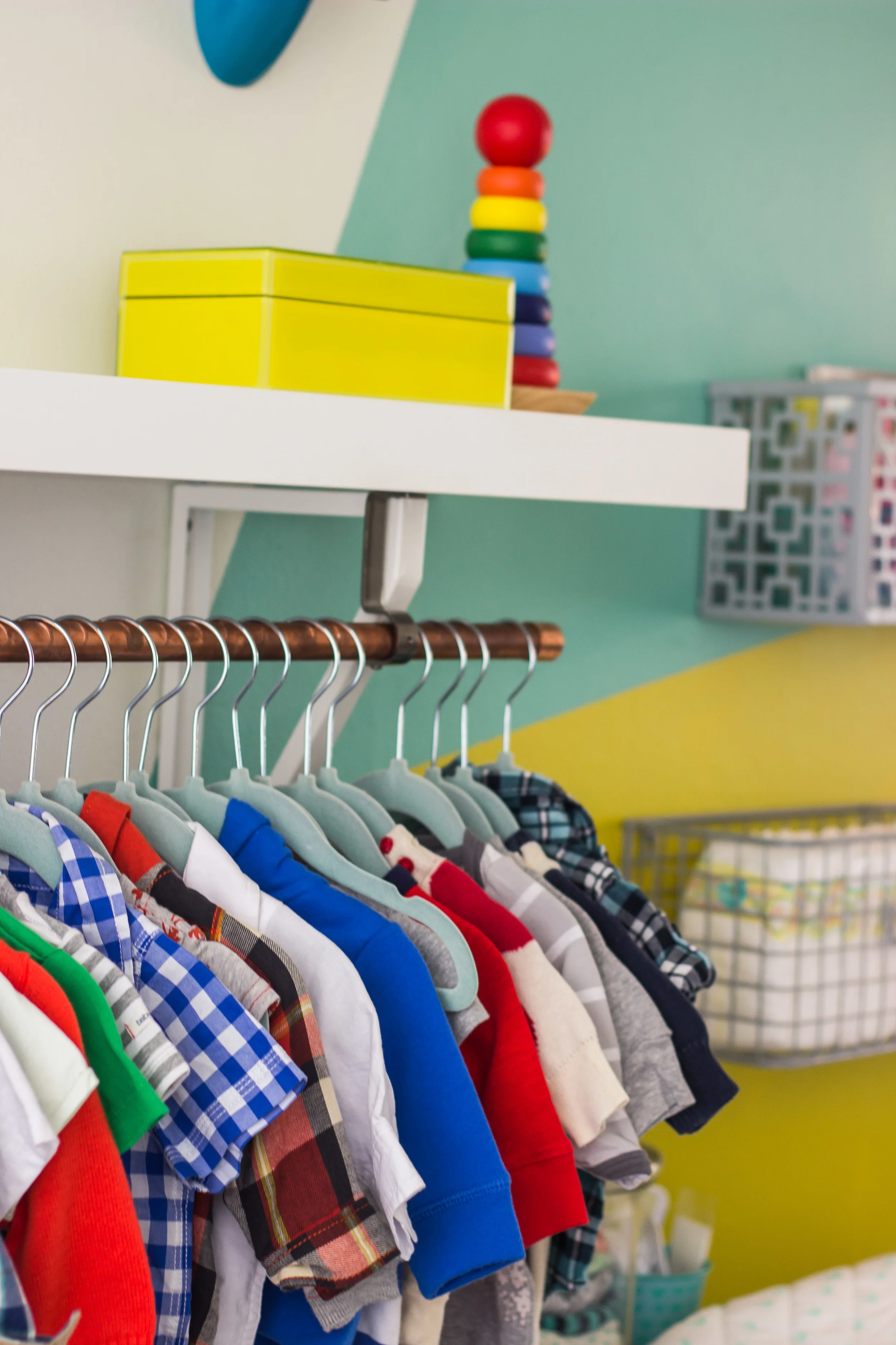
the elephant head was the very first thing i bought for the baby's room. i got it the weekend i found out i was pregnant (from home goods). i also got the little gold display case for shoes, and the maps book that weekend. the globe is vintage, and the deer head, toy and yellow box were all found at home goods. we used an ikea lack shelf (which was a complete nightmare- we ended up adding brackets underneath because it kept sagging). i used old curtain brackets to hang the copper rod (we just screwed them in to the shelf).

the eames style rocking chair (under $100!!) was part of my group gift from my baby shower. i needed something small, because it's such a tiny space. i thought about not having a chair at all- but i'm so glad i got it!

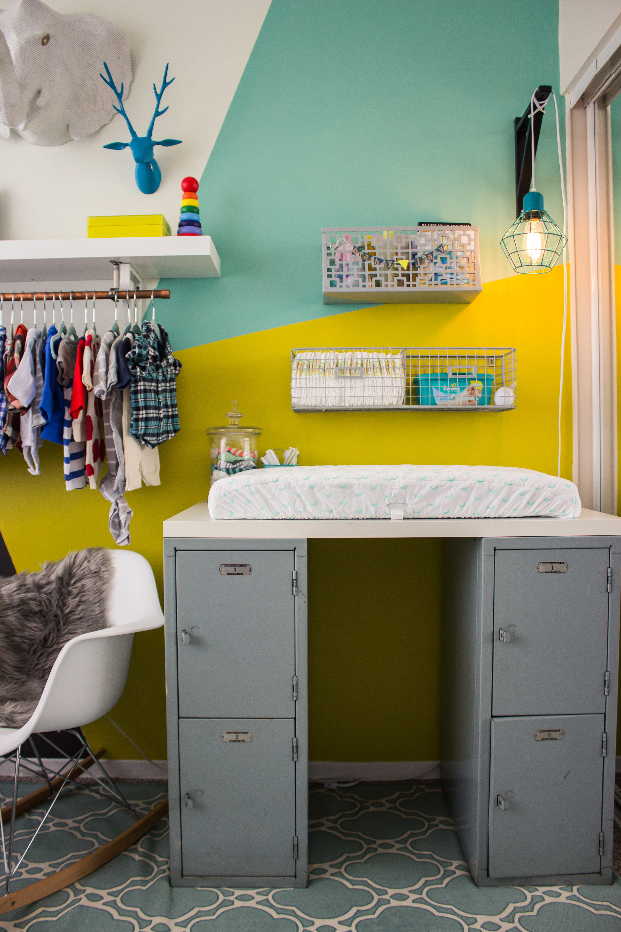
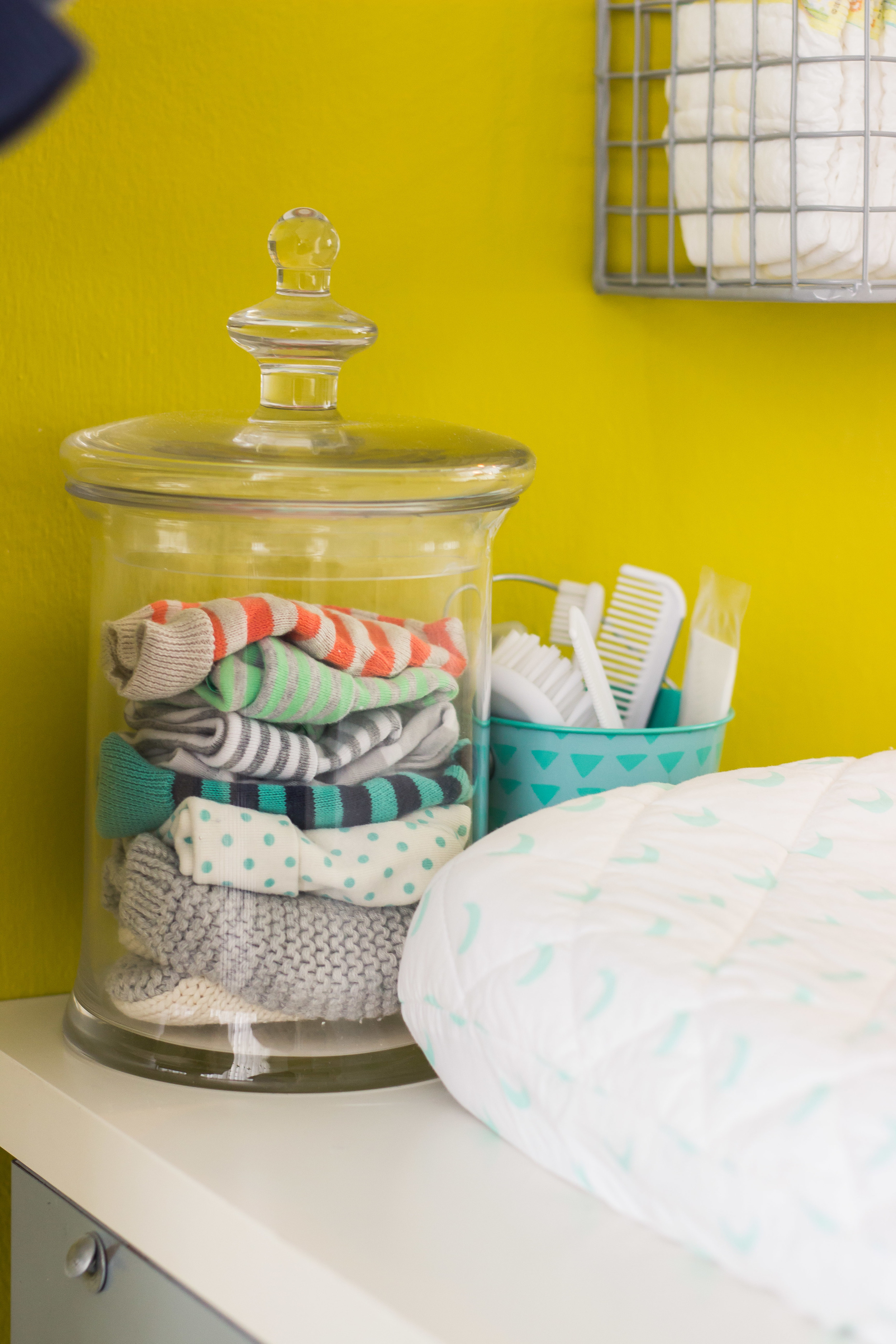
for the changing table we used some lockers that we found in jarman's grandpa's garage. we topped it with an ikea desk, and a changing pad. i got the changing pad cover from the land of nod. we hung organizing baskets above for diapers, wipes, and all the other accoutrements necessary for changing diapers (right now we have books in there too). we used an ikea shelf bracket to hang the cage light (from target).

IMG_8218.jpg

the rug was $30 from ross! such a steal!

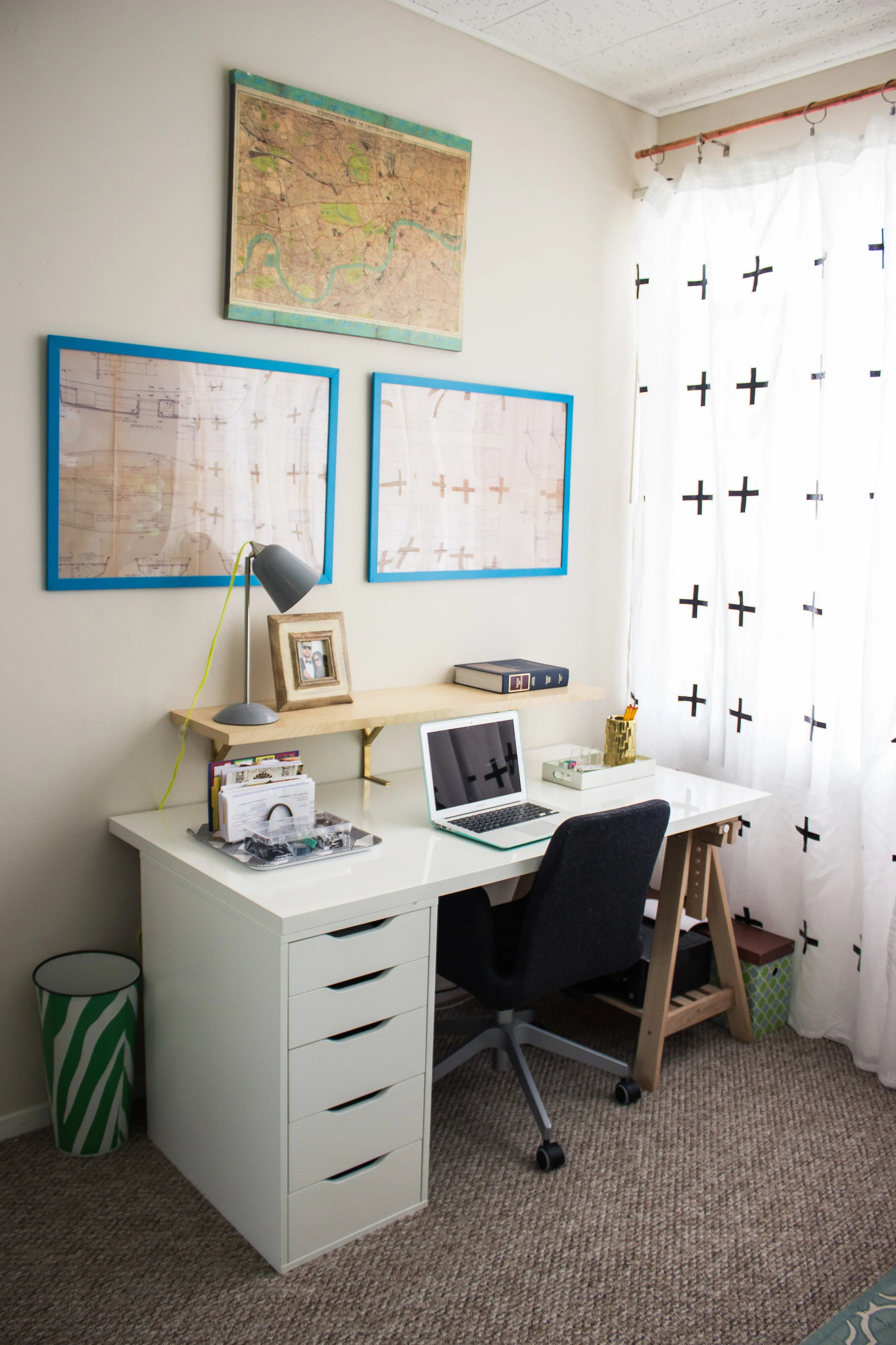
the room is also jarman's office- so we had to include his desk and everything. above the desk we hung some plans that his grandpa had made for a sail boat (in cheap ikea frames). the whole desk set up is ikea- the linnmon collection. 

IMG_8169.jpg

and just one more picture to end on a good note! what do you think???

baby's room makeover / inspiration

i am finally getting started on the baby's room (should i be worried that his due date is just over 2 months away?) i had a mini freak out last weekend about how i had no direction for the room, no color scheme or ideas. so i thought about it all weekend and pretty much figured out exactly what i want to do. so now i'm going from freaking about about having no ideas to freaking out about having none of the things for my ideas, and having time to get everything done. you feel me? here is where we are going with everything. i'm hoping to have it done a month before his due date- giving me just over a month! here we go!

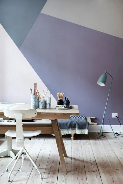
first of all- i have been dying to do a geometric wall. since the baby really only gets one wall (the other side of the room is the 'office', one wall is all windows, and the other wall is the closet) we are painting the background in a geometric pattern. jarman actually got it done last weekend and i love it. it is quite a bit brighter than the walls above (i can't help myself with bright colors). 

i definitely want to have a sort of open closet, with a bar underneath the shelves that we are putting in there.

source

source

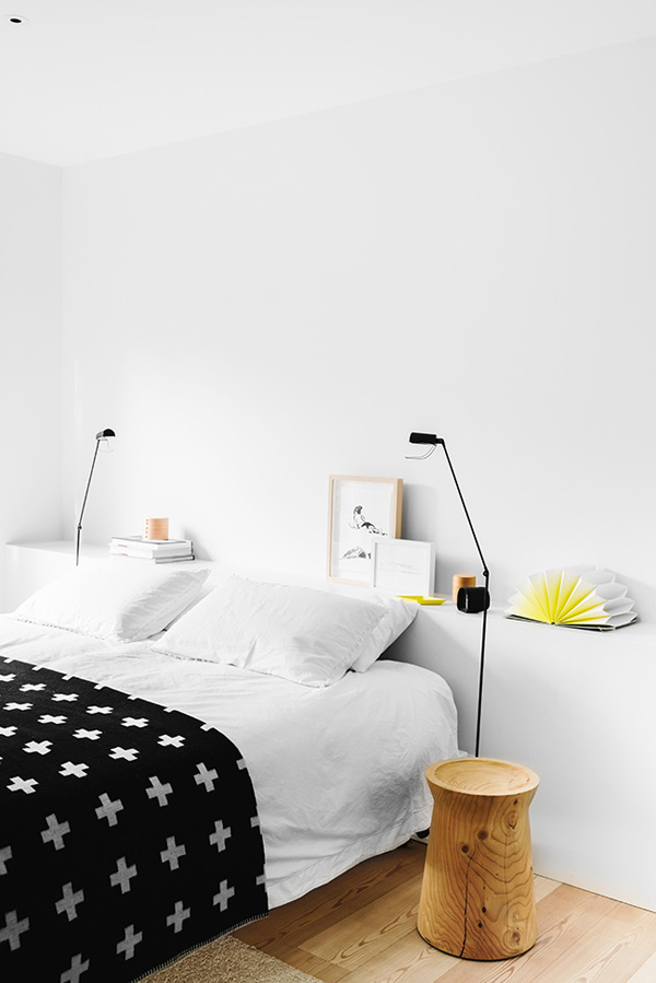
i am loving the plus sign trend right now- i'm thinking i'm going to use it in the curtains for the room. i'm super diy. i bought 4 cheap white ikea curtain panels and an going to paint black plus signs on them. hopefully it turns out- wish me luck!

i am also loving the copper trend- i want to have accents of it in the room. the clothing rack underneath the shelf will probably be copper, and the curtain rods.

source

source

i love natural wood cribs with colored slats. since i'm not going to buy a $600 crib, we are going to improvise by painting an ikea cribs slats.

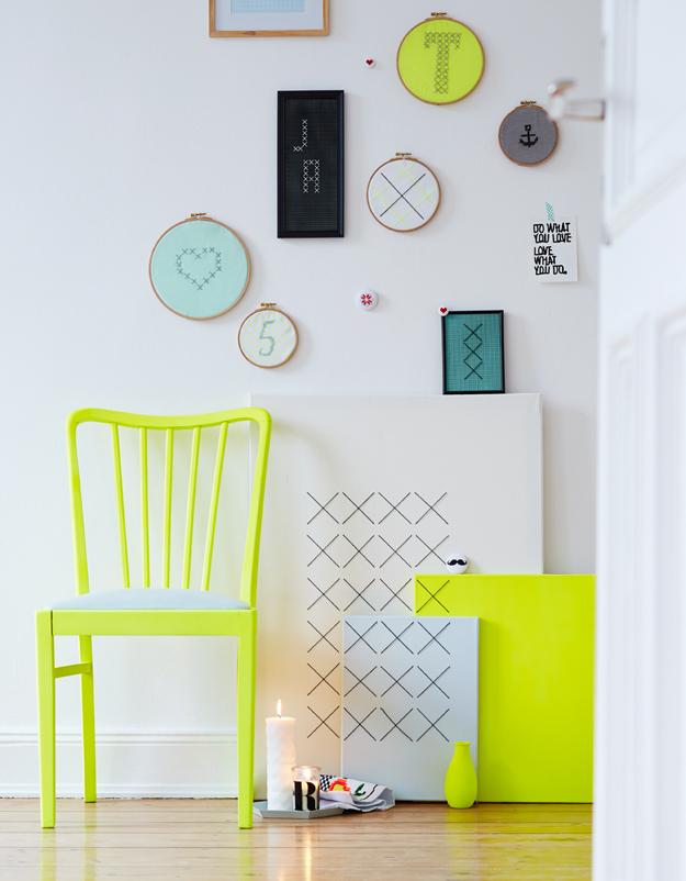
and finally, the color scheme- bright neony yellow, teals, navys, mints, and black and white. and probably a little bit of orange. like i said, i can't help myself with bright colors.